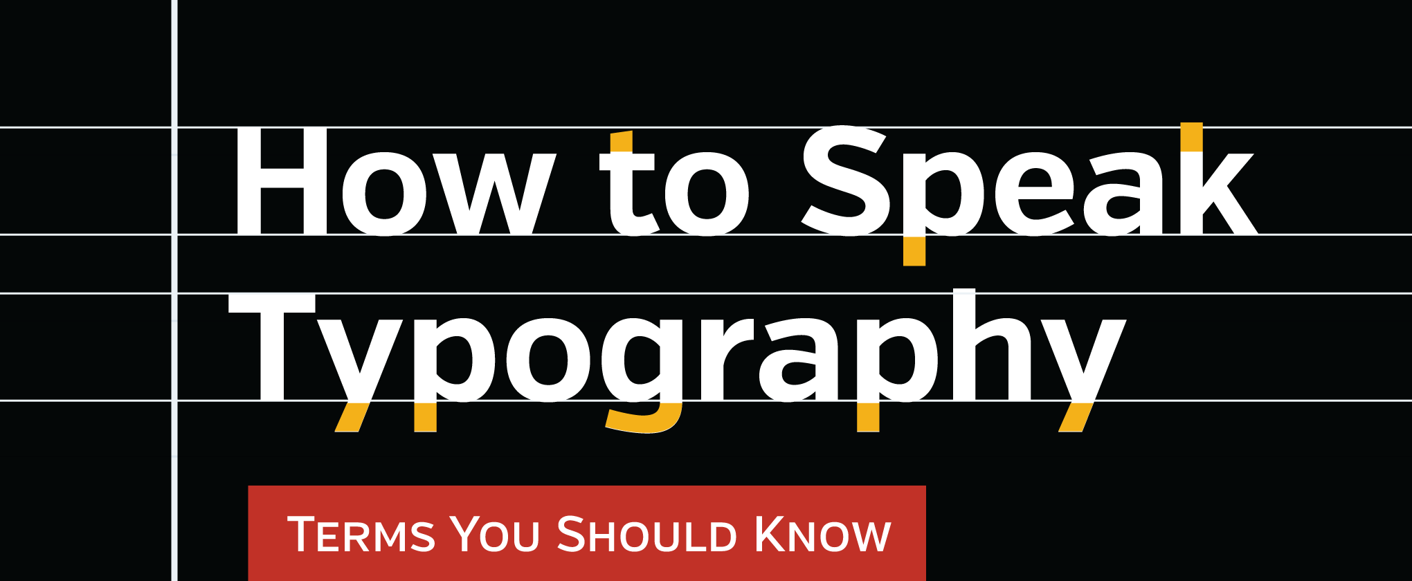
If you are just beginning as a graphic designer, you should be knee-deep in typography and type language, learning how to use it properly and how to speak about it using proper terminology.
This is by no means an exhaustive list of typographic terms, but getting to know these and how to apply them will go a long way toward developing as a typographer; this is useful even if you are not a designer.
Baseline
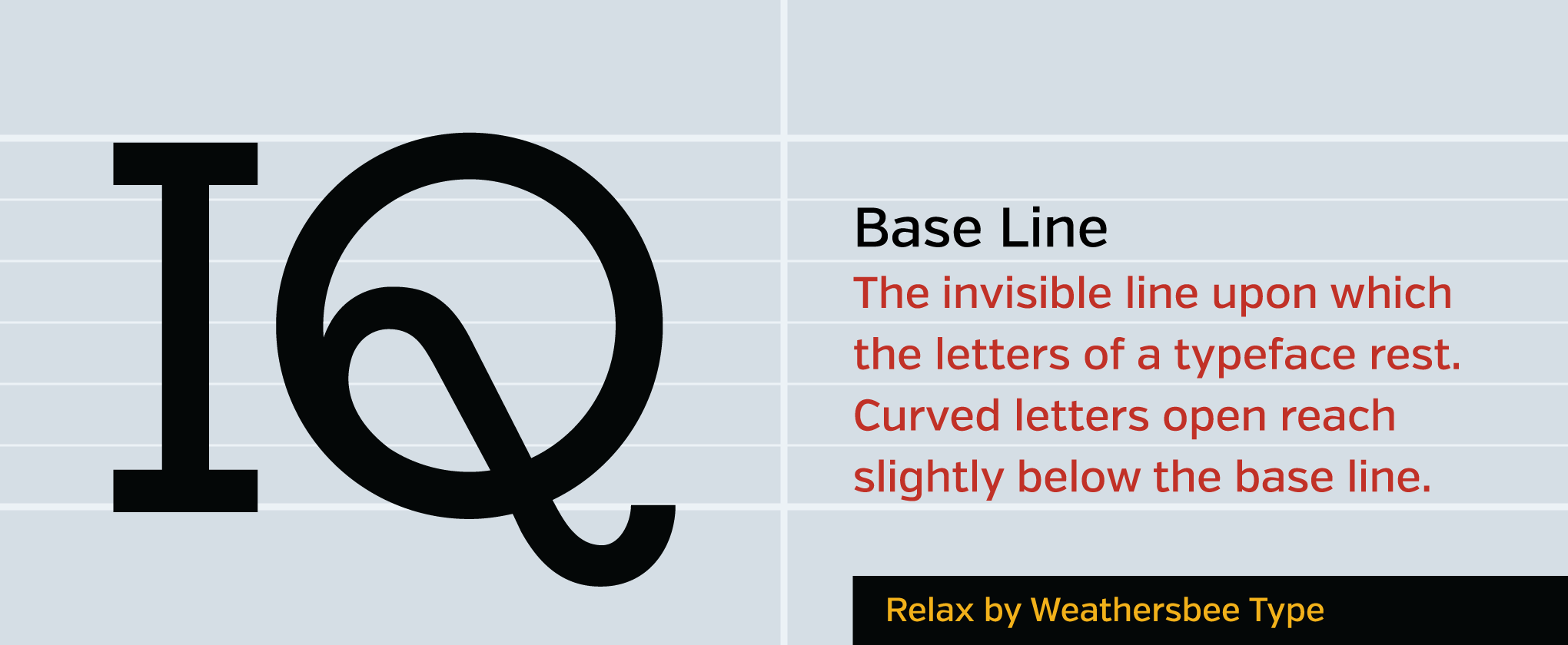
The invisible line upon which the letters of a typeface rest. Letters with flat bottoms (E) are normally flush with the baseline, while curved characters normally descend below it (and also ascend above the cap height).
It matters because:
Letters which are flat should sit flush with the baseline, while curved letters should descend slightly below it (known as overshoot), otherwise they will appear to hover above the ground the other letters rest on.
Cap Height
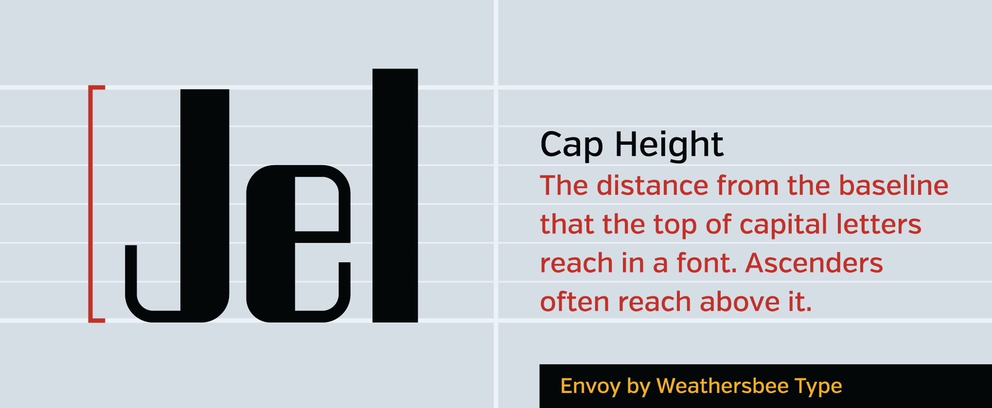
The distance from the baseline that the top of capital letters reach. Letters which are flat on top (F) normally are flush with the cap height. This shouldn’t be confused with ascenders, which often often reach slightly above the cap height of a font, especially in classical type designs.
It matters because:
The cap height of most fonts are the same, while the relationship of other characteristics to the cap height are major factors in the character of a font.
X-Height
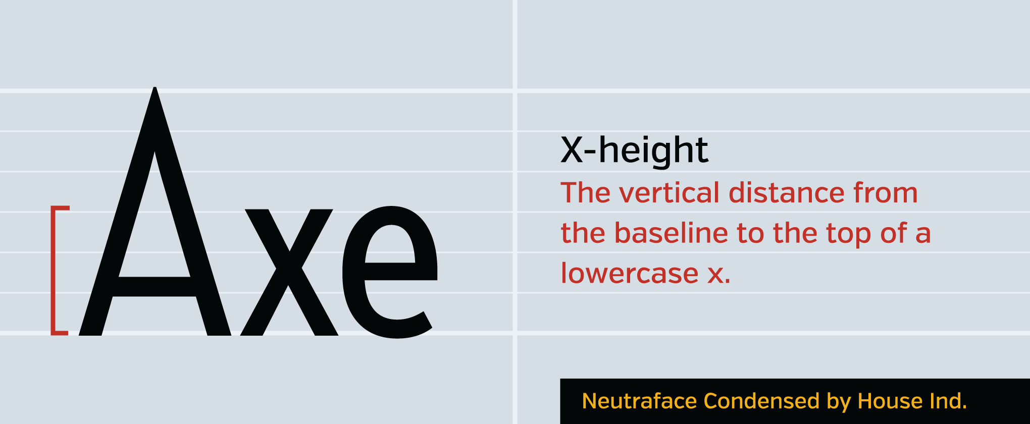
The vertical distance from the baseline to the top of a lowercase x. This amount is not simply to measure the height of an x; it serves as a guide for the size of the main portion of a lowercase letter, affecting the legibility of a letter and its stylistic feel.
It matters because:
The x-height of a font is a primary determiner of its legibility. Consider that the most distinctive and most used letters of a typeface are lowercase letters. When the main portion of a letter is given more space, its distinctive features are more prominent and its counters are more pronounced.
Counter
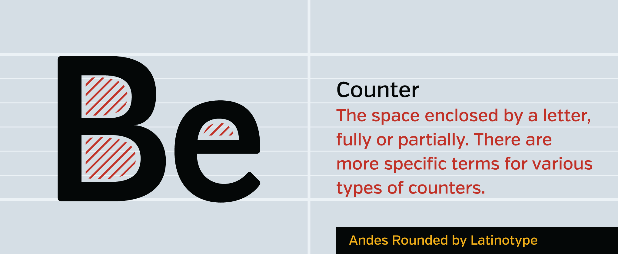
The space enclosed by a letter, fully or partially. There are more specific terms for various types of counters.
It matters because:
The counter of a letter gives as much distinction as the strokes of the letter, serving as its negative space.
Ascender
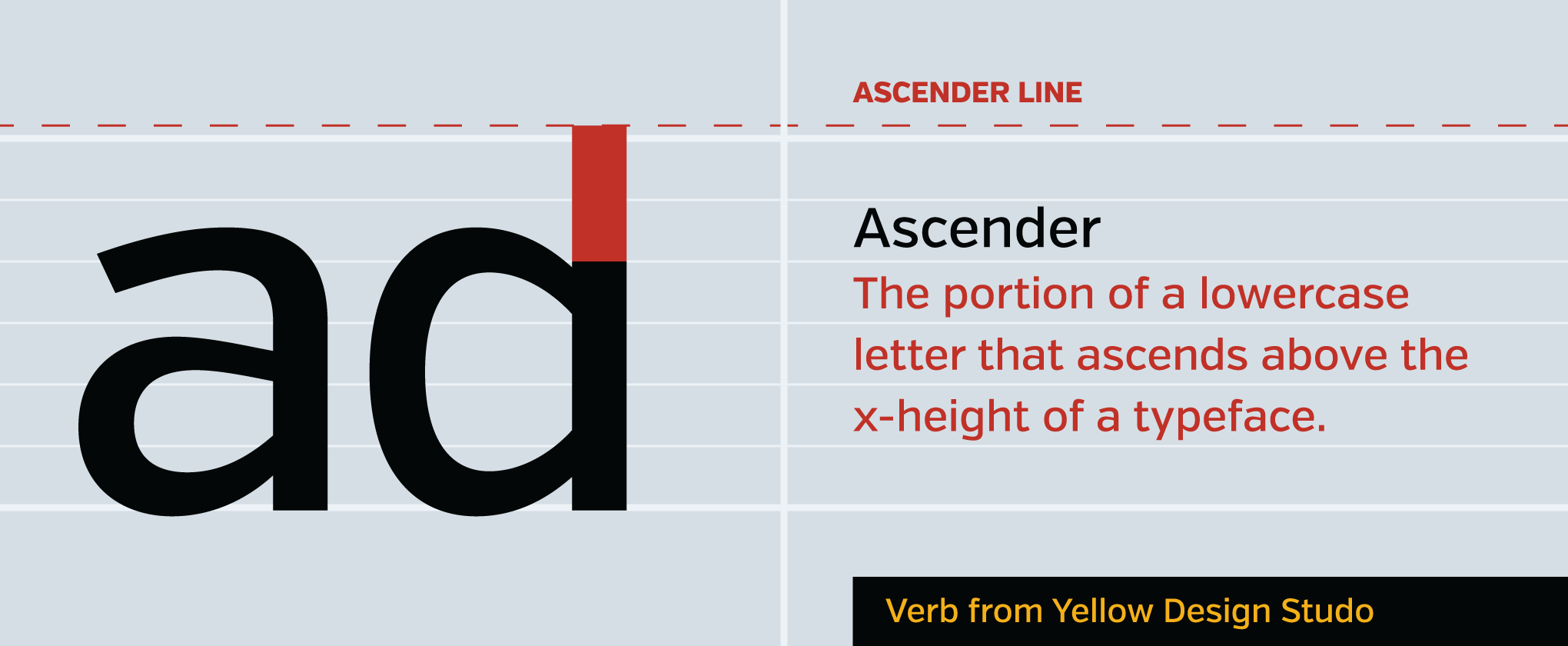
The portion of a lowercase letter that ascends above the x-height of a typeface. Letters with ascenders include d, b, and f. Ascenders often reach above the cap height of a typeface.
It matters because:
The style and height of ascenders are major factors in the legibility and style of a typeface.
*Ascender line
When letters do reach above the cap height of a font, they normally do so consistently, reaching to another guideline called an ascender line.
It matters because:
Letters with ascender lines vastly different from their cap height become very stylized; they are distinct but generally hard to use as body text because of conflicts with preceding lines’ descenders.
Descender
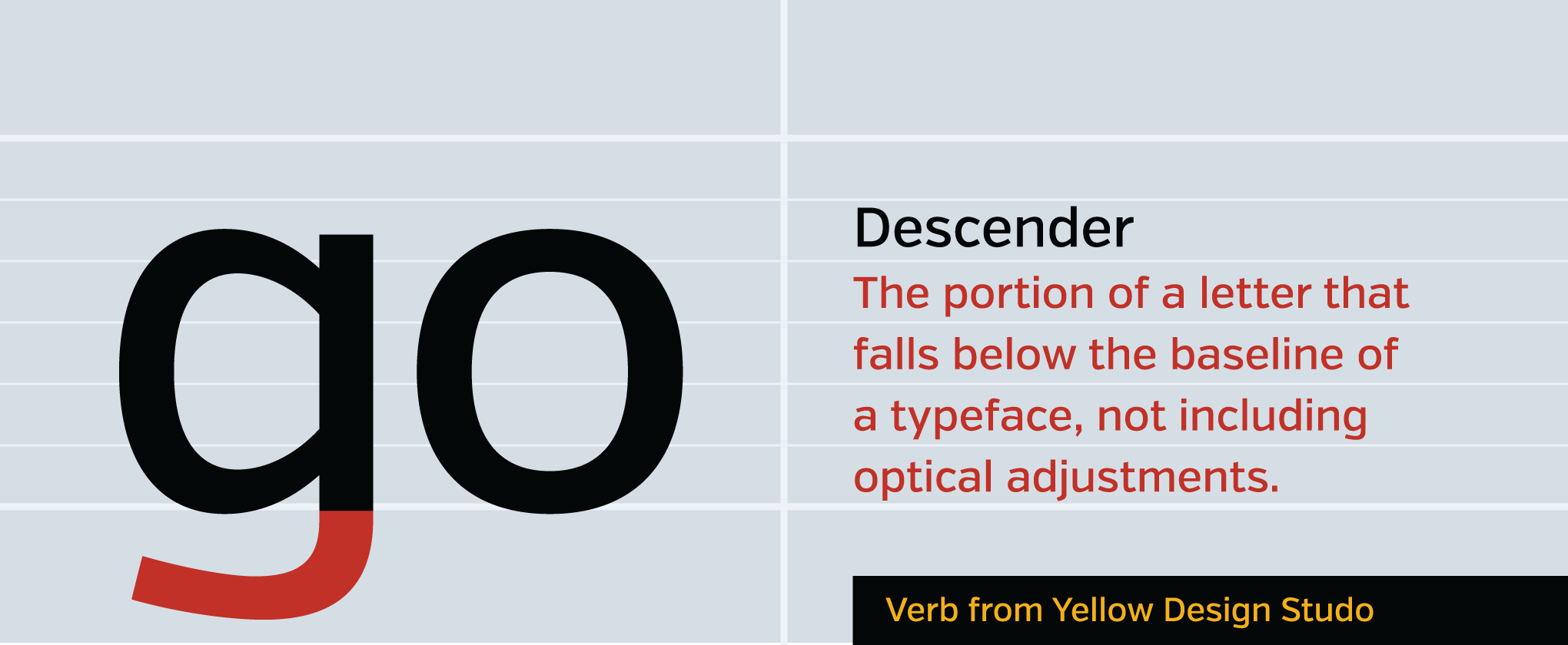
The portion of a letter that descends below the baseline of a typeface, not including simple optical adjustments like overshoot. Letters with descenders include g, j, and p (not exclusively).
It matters because:
As with ascenders, the length of descenders of a typeface often define its character but also determine its utility as body text. The ascenders and descenders of Zapfino make it unusable.
Leading
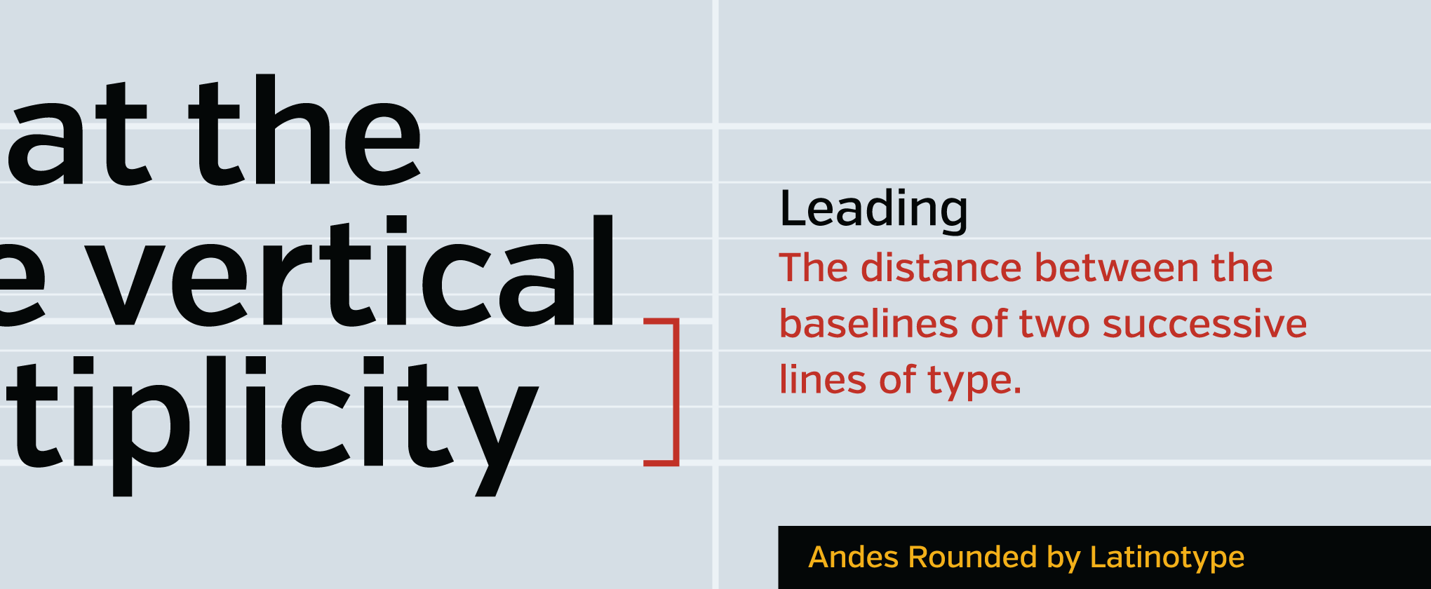
The distance between the baselines of two successive lines of type. Sometimes referred to as line height or vertical spacing, the official name comes from the strips of lead used in traditional movable type to separate lines of type.
It matters because:
The amount of leading given to a body of text is key in its legibility. Around 125–140% the font size is normally a good starting point, but every font is different. Lines with tall x-heights often feel too tight with default leading and require the vertical space to be opened. Lines of type that are larger and part of a heading require smaller leading so they don’t appear to be distinct statements.
Tracking
Not be confused with kerning.
![]()
The horizontal spacing between letters on a line, also known as letter-spacing on the web. This refers to the spacing over a length of text, not simply between two letters.
It matters because:
Too much spacing between letters can kill legibility, as our eyes tend to read words we know as shapes, rather than picking out individual letters. A little extra tracking can add class, however, to a line of small capital text.
Kerning
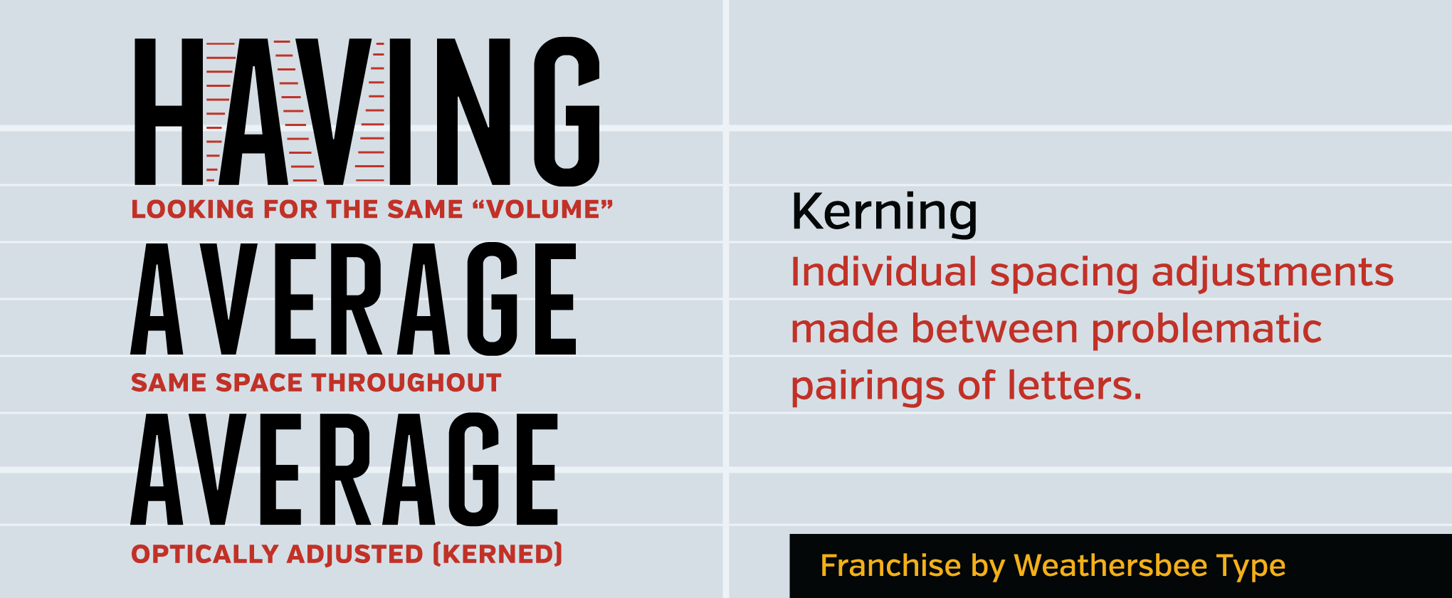
Individual spacing adjustments made between problematic pairings of letters to give the appearance of equal space throughout a line. This is often confused with tracking, as they both deal in horizontal space.
It matters because:
The different shapes of letters require different spacing between them to give the appearance of uniformity. The spacing of letters in a font, even with built-in kerning, is rarely perfect, and some letters inherently require user adjustments so they don’t confuse the reading of letters. When applying kerning, a good rule is to create an equal volume of space between letters. Generally speaking, diagonal letters, like A and V shown above, require extreme kerning. Curved letters (C, O) require moderate kerning, while upright characters (M, N) require none or even more open spacing to achieve an optical balance.
Small Caps
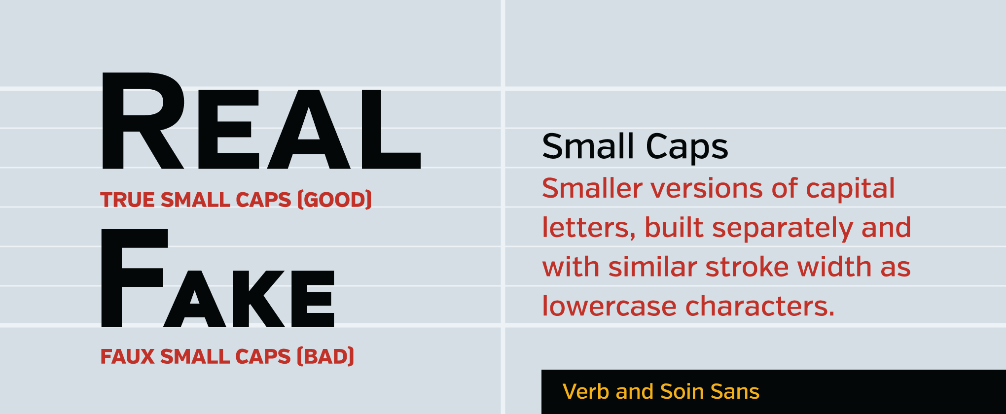
Small caps are what they sound like: they are smaller versions of capital letters, often to be used as stylistic variants. Small caps bear the same stroke weight as their lowercase counterparts, so the letters in a line appear to fit together naturally.
It matters because:
If a typeface doesn’t contain small caps, then a fake version of them can be created by software, which simply downsizes the non-capital letters into faux small caps and leaves the capitals the normal size. The natural problem with this is the down-sized caps stick out like sore thumbs; the shrunken caps have a far smaller stroke width than the natural versions, leaving the regular capitals appearing overly bulky (or the fake small caps looking wimpy). In summary, don’t use fake small caps.
That’s a wrap!
That’s gonna do it for now. If you wanna dive deeper into type, consider signing up for a typography intensive such as a personalized type & font design class. They aren’t scheduled yet but you can sign up to be among the first ones to know and receive any exclusive deals for the early birds.