The Topic at Hand
Let’s talk about your role within the world of journalism and media as it pertains to typography and your type-handling. It’s huge. It’s life changing. You had better understand and embrace this role. You’re already participating, so there’s no going back now. This question is, will you shrink from it, or will you wield it?
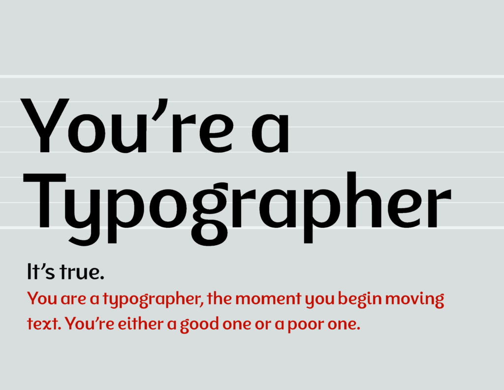
You’re a Typographer
What I’ll talk about next is not universal in its specifics. But the process, the intensity of focus, the clarity of vision, the conviction of choices involved — these will extend far beyond the little world of typesetting and publishing. If you learn to think critically, for yourself, always hungry for improvement, discovering when you’ve reached the point of capably discerning feedback; it’s at that point that your creative work will become your own and your weapon, and you’ll find that conviction seeping into every part of your life.
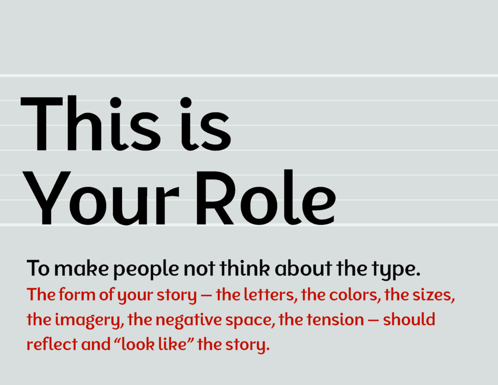
Your Role
You are a typographer the moment you begin manipulating text. You’re either a good one or a bad one.
The role of typography, and therefore your role as a typographer, is to make your story and its most important points clear, and not make people think about the type. If they’re thinking about it, they’re distracted (or they’re designers). This endeavor often involves using interesting fonts, layouts, dramatic hierarchy, and beautiful images. But your handling of the type, font choices, and design moves should be invisible because they fit the content so appropriately. The form of your story — the letters, the colors, the sizes, the imagery, the negative space, the tension — should reflect and “look like” the story.
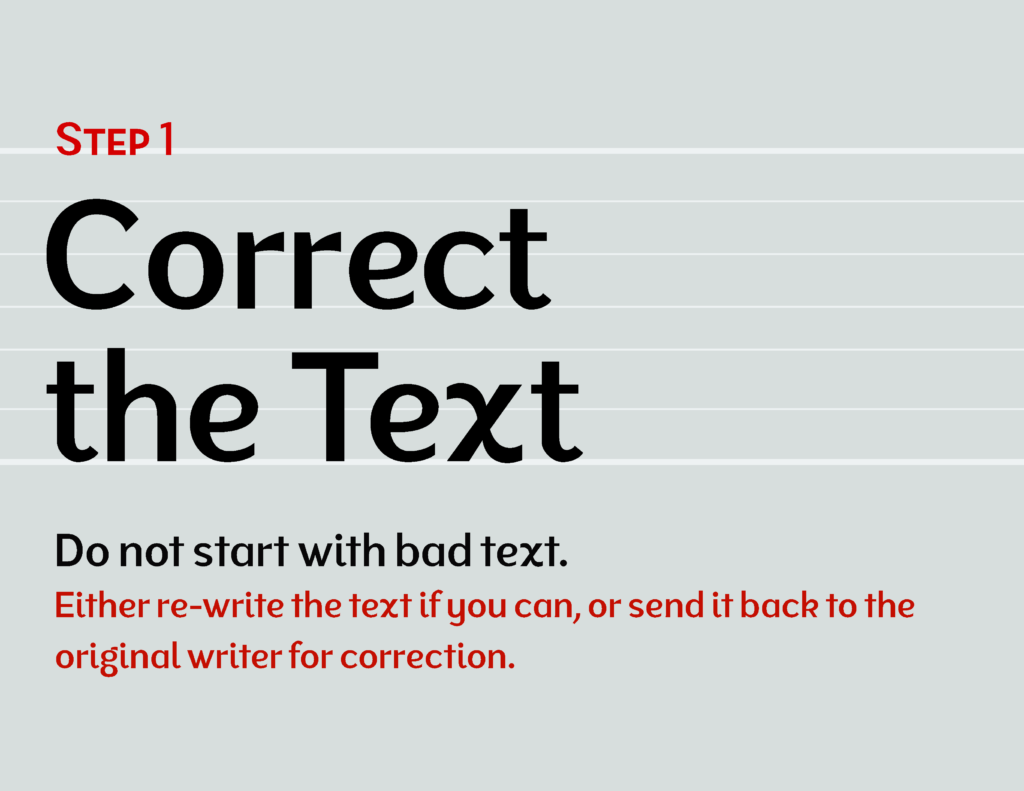
Step 1.
Correct the Text.
Fix the characters.
Make sure you’re starting with good text. This means you have to read it. This includes the actual content, but also the punctuation, the flow, and the structure of it. If it’s bad, fix it to the extent possible within your role. (Hint, step outside your given role.) If you can’t, send it back to the writer and tell them to fix it. Nothing screams “amateur” louder in the raw text of an article than double hyphens. That should be an em dash. The dash between ranges should be an en dash. Make sure the correct type of quotes are being used. You shouldn’t see straight quotes unless you’re writing web code or talking about measurements.1
You can fix these things quickly by using a search and replace.
Fix the content.
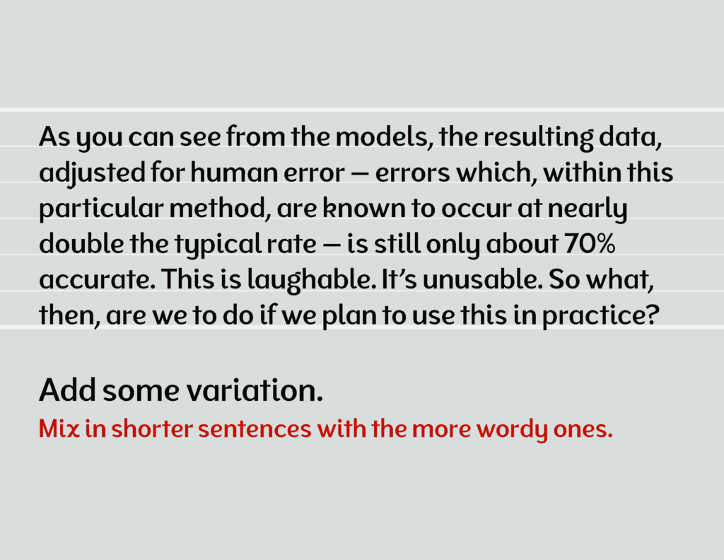
Within your authority, do not allow the text to spew robotic sentences. Don’t allow it to spout nonsensical sentences. Break up the long-winded, qualified statements with the occasional 5 word sentence.
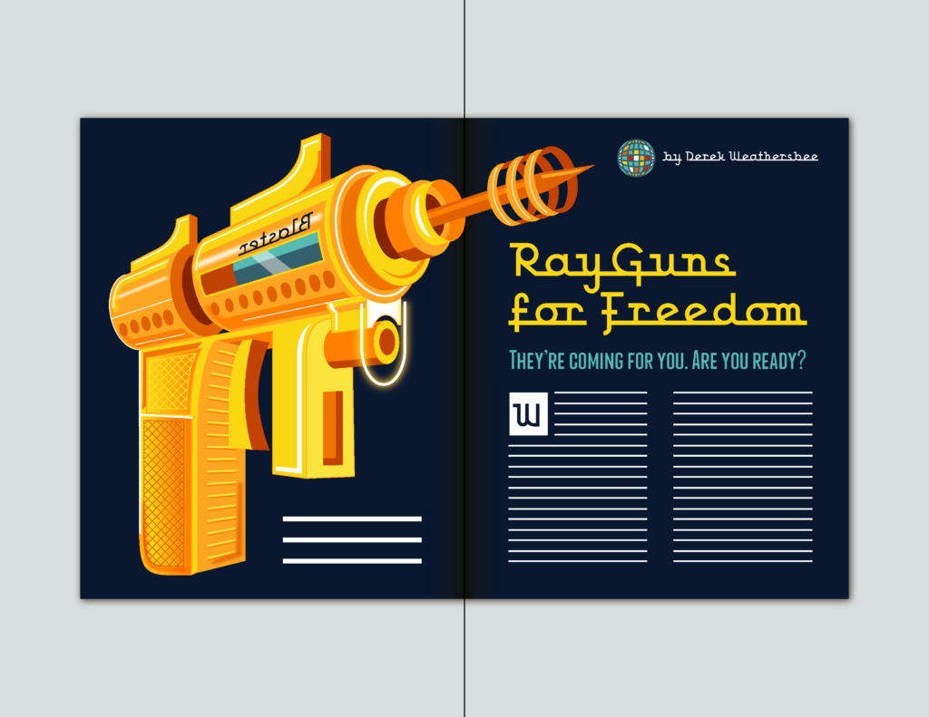
Take this passage for example:
“As you can see from the Ray Gun Mortality models, the resulting data, adjusted for human error — errors which, within this particular method, are known to occur at nearly double the typical rate — is still only about 70% accurate. This is laughable. It’s unusable. So what, then, are we to do if we plan to use this in our regulations on Ray Guns?”
The short sentences re-assure the reader that another human is on the other side of this text, and that they are capable of understanding it. And in case you’re wondering, the topic of the above statement IS nonsense; I made it up on the fly.
Step 2.
Organize the Content
See what you’re working with.
Set your type roughly, place in your imagery and other content, such as graphs, timelines, or relevant visual content. Do consider your font and size at this point, as it will determine the length of the text and therefore the remaining space you have to place your imagery, pull quotes, drop caps, and your dramatic title. Use text that is somewhere between 7 and 11pt for print.
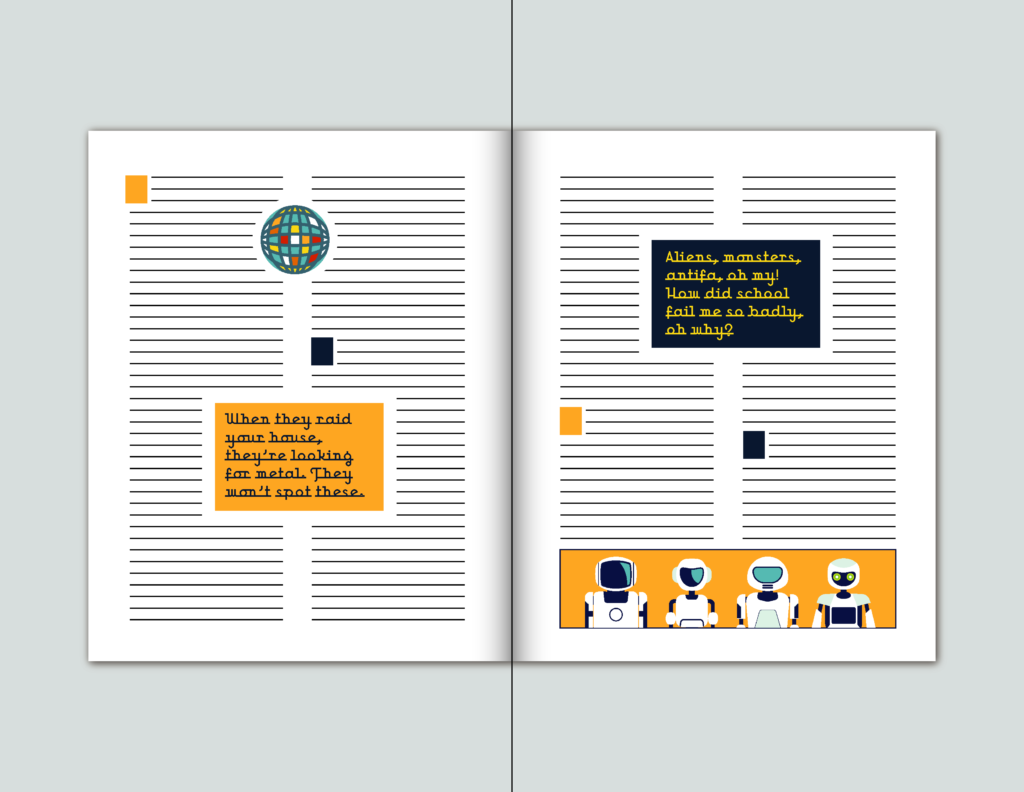
Make it look like the content.
Add contrast. Add intrigue. You need to guide the reader through the text, because nobody is itching to dive into a wall of text. That’s why we have snarky lexicon like WOT and TL;DR. So, adjust the size and style of your title, drop colors from your imagery into your text, give subtitles which bear a touch of style if appropriate, add pull quotes to entice the reader; use drop caps to indicate a new line of thought and further enhance the texture of your typography.
All these decisions will play into the way your entire layout looks, and whether it can keep a viewer’s attention. And you know what else it does? It saves time. If the content of an article isn’t up someone’s alley, save them the agony of trudging through and abandoning content that doesn’t interest them.
Step 3.
Clean it Up
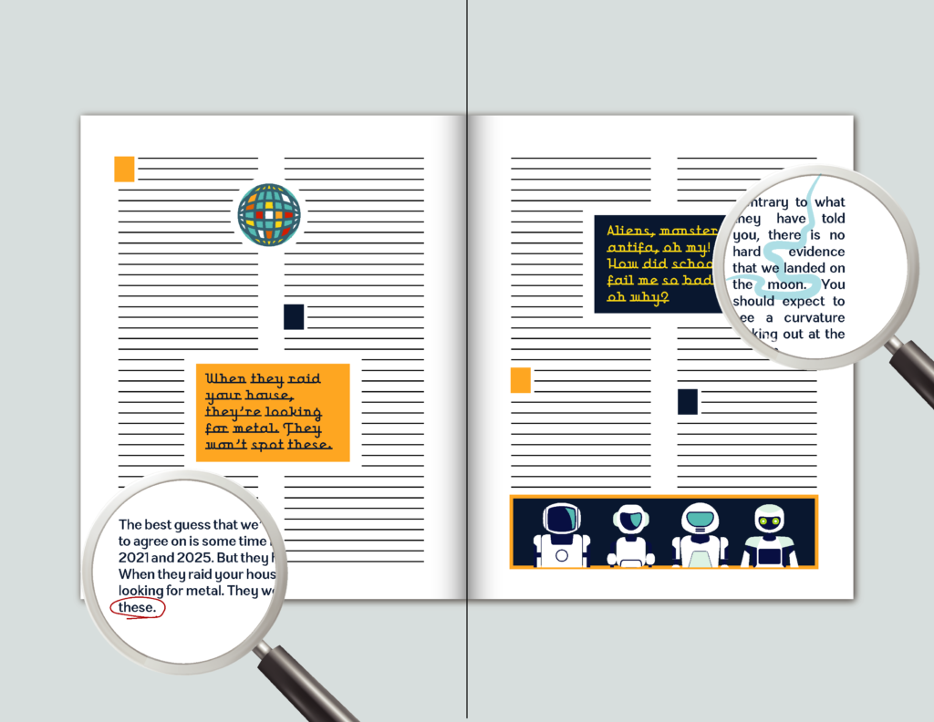
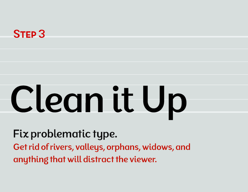 Find and get rid of rivers and valleys, orphans, widows, and other design problems that are distracting. You will likely be using justified columns, because that allows an unnaturally large surface of text to retain a semblance of organization. The natural result of this is that your text will not be aligned in the ideal way. The natural way. The ideal alignment is, of course, flush left text with a ragged right edge. Its spacing was determined by the diligent type designer, so we let words fall to a new line when they hit their natural wall, regardless of how flush the edge is. Anything else is a step away from legibility.
Well, that step is one that we have to take. Your job, then, is to minimize the illegibility and distraction. This demands focus and dogged tenacity that most would consider foolish. But you know better.
Step 4.
Stick the Landing
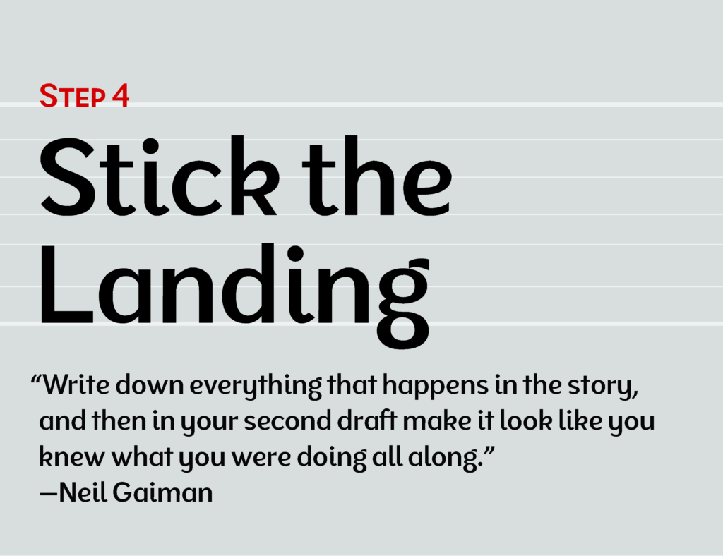
“Write down everything that happens in the story, and then in your second draft make it look like you knew what you were doing all along.”
—Neil Gaiman
You want the layout to land in a way that appears to have been destined all along. Of course, this is not the case; you can’t know exactly how to arrange and break up your content so that it ends exactly as you wish until you’ve gone through hours of shuffling and correcting and resizing. But in the end, if you have two spreads allotted for your story, it should occupy those spreads in a way that feels deliberate. I didn’t say fill it. But you should not have an incomplete column, for example, at the end of the story. This is clearly poor planning and a mistake.
Quick Tips
The overall quality of any text-heavy design work is determined largely by how the body text looks. Why? Because there’s more of it than anything else. So, as mentioned before, you should focus first on making the body text look good. Then introduce other elements, hierarchy, and embellishment.
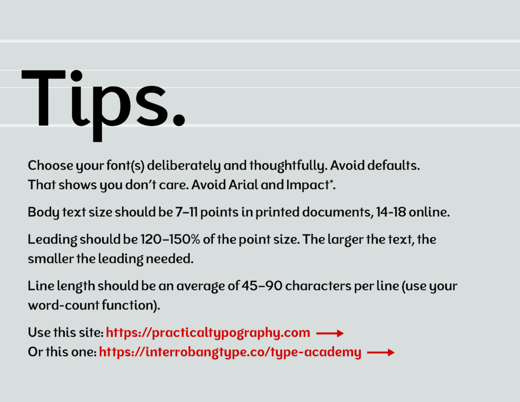
- Choose your font(s) deliberately and thoughtfully. Avoid defaults. That shows you don’t care. Avoid Arial2 and Impact3.
- Body text size should be 7–11 points in printed documents, 14-18 pixels on the web4.
- Leading should be 120–150% of the point size. The larger the text, the smaller the leadings.
- Line length should be an average of 45–90 characters per line (use your word-count function).
- Use this site: https://practicaltypography.com, created by the fellow mentioned below.
A nifty trick from Matthew Butterick (whose tip format I’ve borrowed and adjusted to my preferences) is to drop 2-3 instances of lowercase letters in a string, like so:
abcdefghijklmnopqrstuvwxyzabcdefghijklmnopqrstuvwxyzabc
See how that works?
Epilogue
You will not succeed if you don’t do more than what you’re made to do, taught to do, or required to do.
So take what I say. Digest it. Run it through the mills. Build upon it. If it’s trash, dispose of it. If it’s wisdom, embrace and implement it, and pass it on. Credit your muses and mentors at every turn. But above all, what determines your expertise is you. Let luck play its role, as it does. You still control whether you’re prepared when the opportunity comes along.
Notes
- This is of course not the only instance for using straight quotes, but the most common one for the average writer.
- Arial is fine for the average user, but not for you. Use Helvetica, or better yet find something that better reflects your content and which isn’t so overused. Read the origins of Arial, or type the word Reaction in both Arial and Helvetica and the results speak for themselves.
- There’s nothing inherently wrong with Impact, it’s simply the go-to font for people who want a thick, chunky headline text and therefore appears generic. Broaden your horizons.
- Type on the web should not be set in fixed units, but relative ones like ems or (my preference) rems, as this allows the viewer to adjust the size according to their preferences. But it is helpful to know that the default font size in browsers is 16px.